Styles
Custom CSS styles can be applied directly from the plugin. This allows you to tailor the appearance of your components without needing to modify the underlying code.
The plugin comes loaded with a set of unique CSS shadows and animations that can be applied to any element with a single click.
Shadows
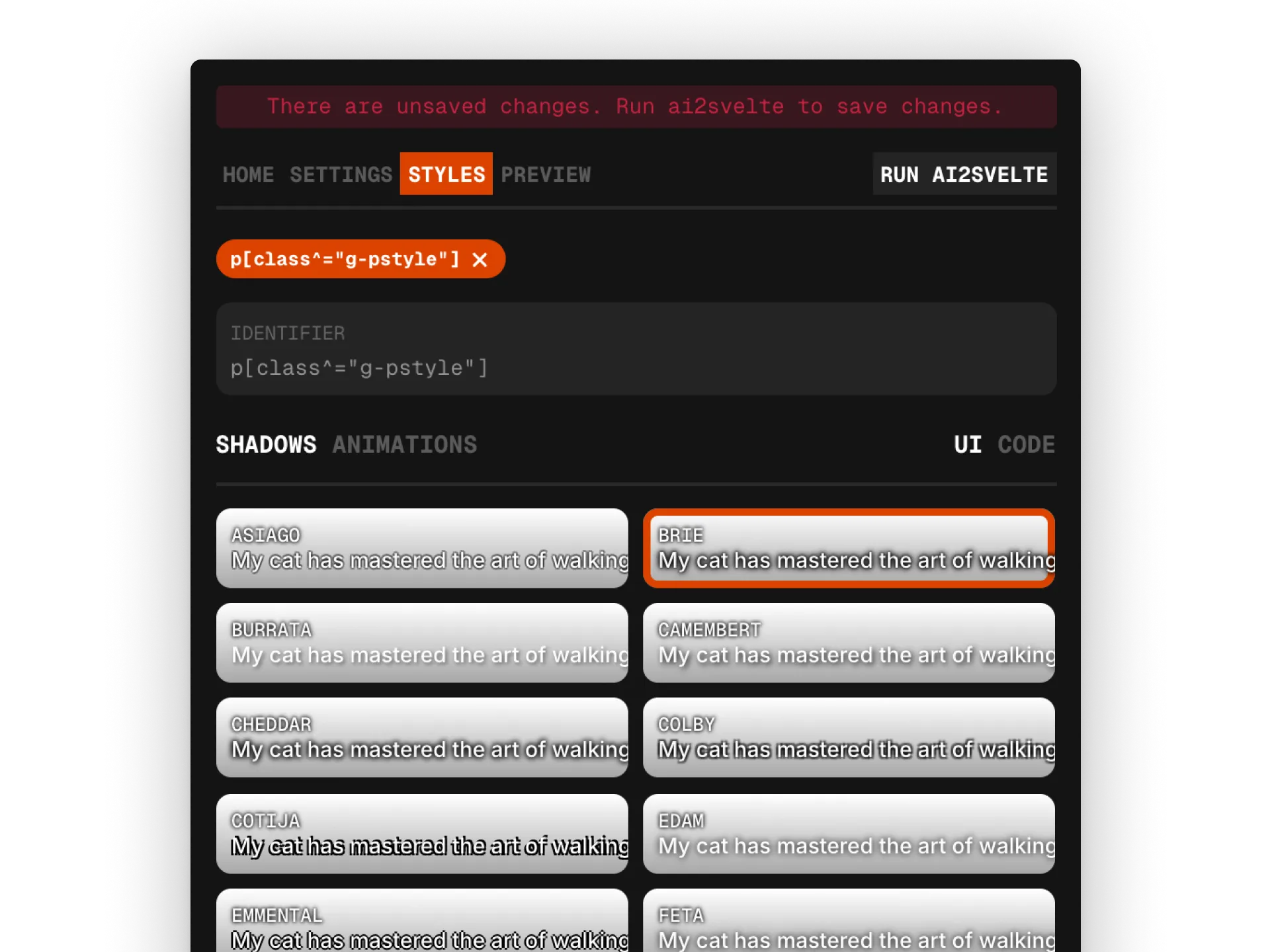
Section titled “Shadows”The ai2svelte plugin includes a variety of pre-defined shadow styles (sourced from Luis Sevillano’s cheesy-shadow-picker) that can be easily applied to your components.
To apply a shadow, enter an appropriate CSS selector in the identifier textbox or setup AiHostAdapter to auto detect selector and select any of the shadow styles from the cards provided below. The CSS code associated with the selected shadow will be automatically added to the generated output file.
The floating toolbar at the bottom provides few tools like changing the backdrop in the cards to check how the shadows look against different backdrops, changing the type specimen along with its weight, text fill color and changing the shadow color.
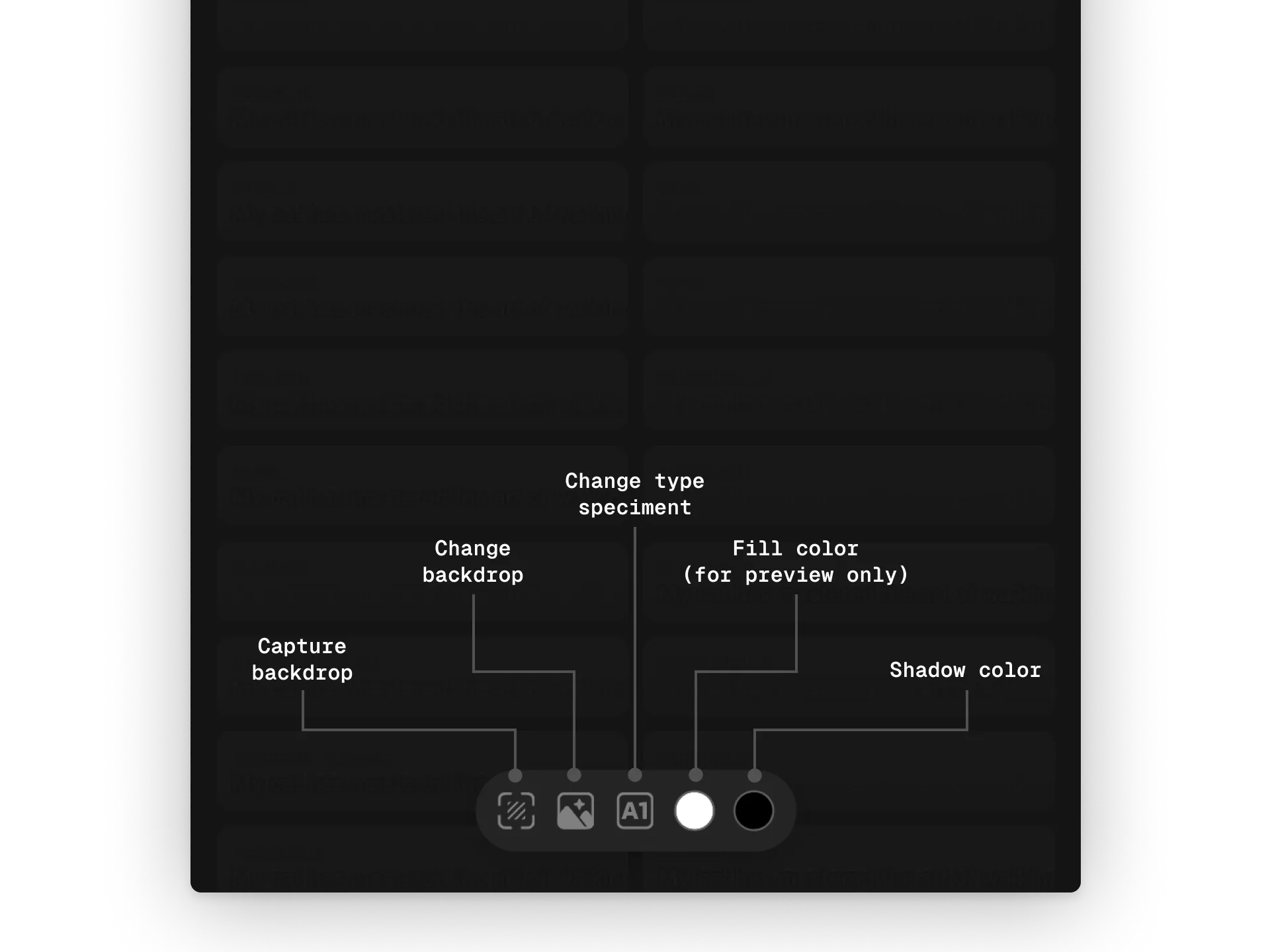
The plugin also provides an option to capture screen and set it as a backdrop to test the shadows. Click on the ‘Capture backdrop’ button and click-drag across the screen to capture the desired area.
The backdrop, text and text fill color do not affect the generated CSS and are only for preview purposes.
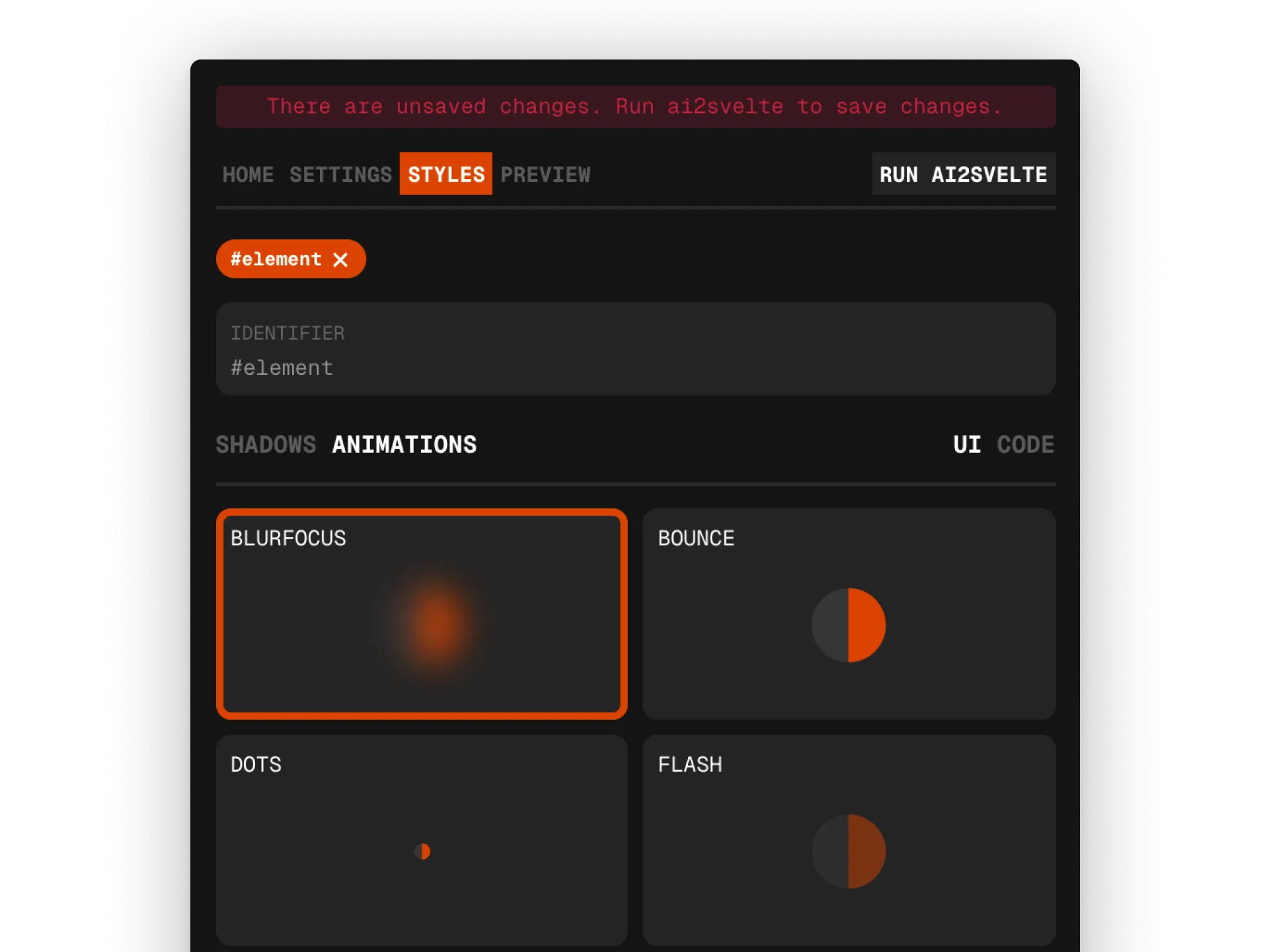
Animations
Section titled “Animations”The ai2svelte plugin also supports a variety of animations that can be applied to your components.
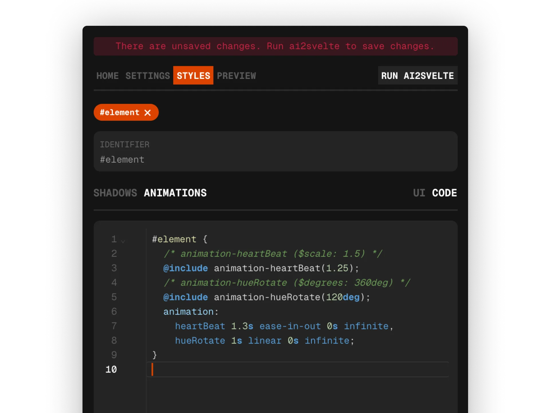
Advanced styling
Section titled “Advanced styling”Changing the view format to Code allows users to directly write SCSS code for more advanced styling options.
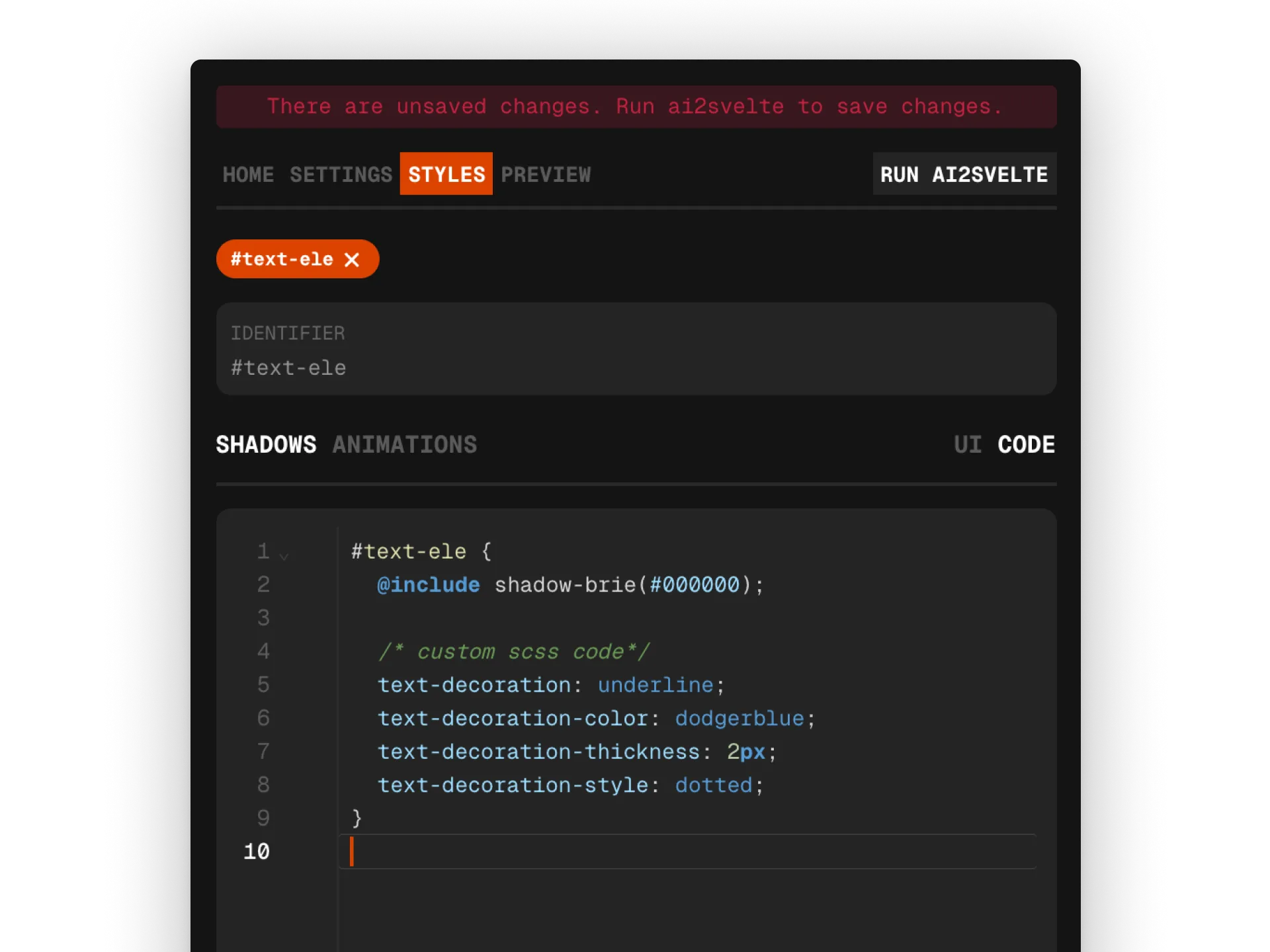
Shadow mixins are defined with a color as an argument. Similarly, animation mixins are also defined with associated arguments and can be customized further.