Dos and Don'ts
This guide will help you make clear charts that tell compelling stories.
Data units
✘ DON'T Forget to indicate the units in your data
✓ DO Add units to your axes
You must always tell a reader if your data is in millions of dollars, tonnes of CO2 or whatever data unit you’re showing.
Often, the easiest way to indicate common data units is to add a prefix/suffice in the “Check & Describe” tab in Datawrapper:
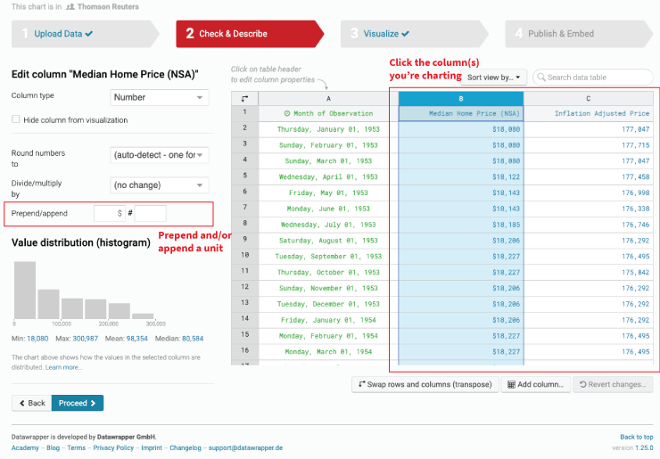
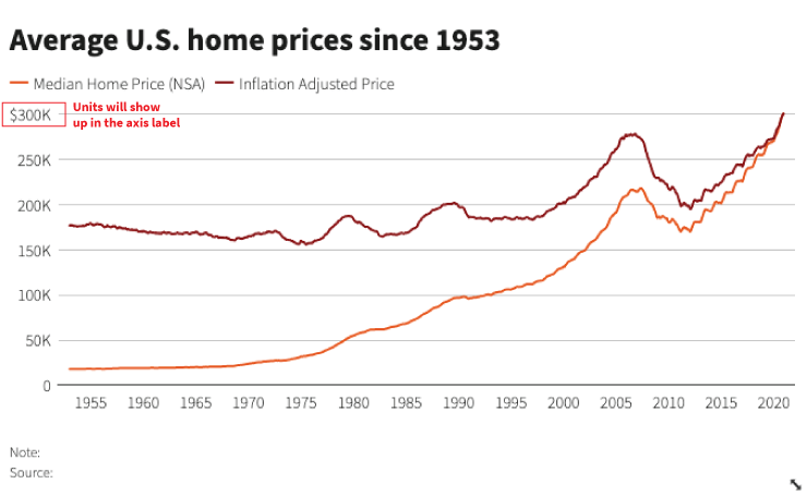
For example, adding a $ prefix and a K suffix will add the dollar sign and the thousands symbol to the y-axis label:
Round large numbers consistently
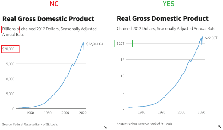
✘ DON'T Mix and match rounded number levels
✓ DO Use decimals and suffixes to label values consistently
Financial and economic data are often expressed in millions or billions of dollars. If you don’t convert those numbers, the reader has to do math. For example, convert “1,000 billion” to “1 trillion” to make readers’ lives easier.
There are two ways to handle this:
-
If your data is in Excel, you can do that conversion yourself before pasting your data into Datawrapper.
-
You can also do this in Datawrapper under the “Check & Describe” tab:
- Divide or multiply to get clean decimal numbers.
- Append the “K” (thousands) “M” (millions), “B” (billions), etc., suffix
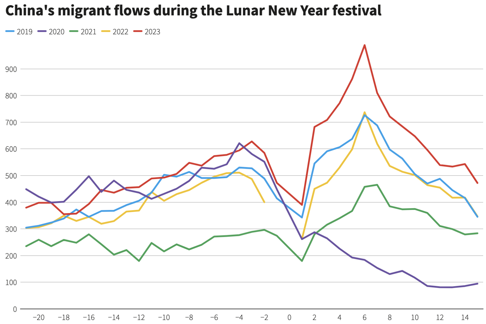
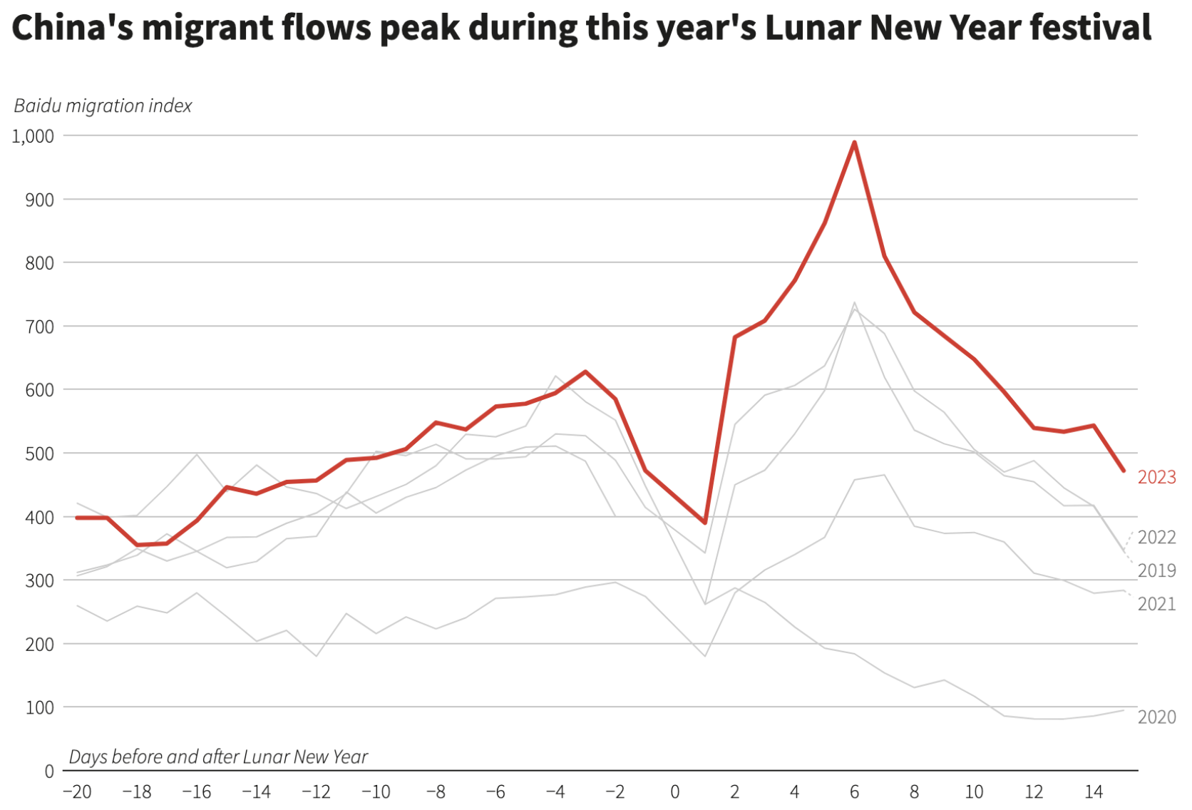
Too many colours
✘ DON'T Use more than 3 colours in charts
✓ DO Use colour to focus your chart’s argument
Colour is one of the most powerful visual dimensions in a chart. It can either distract or focus your reader’s attention. We want the latter.
A good rule of thumbs is if you’re using more than 3 colours in your chart, think about it: Can you simplify your colour scheme for clarity?
Below is an example of a chart that is much improved by simplifying the colour scheme and focusing the reader on the latest year, which outstrips all years prior.
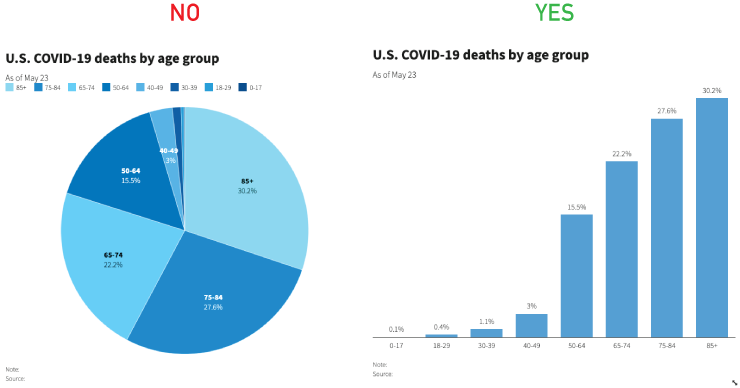
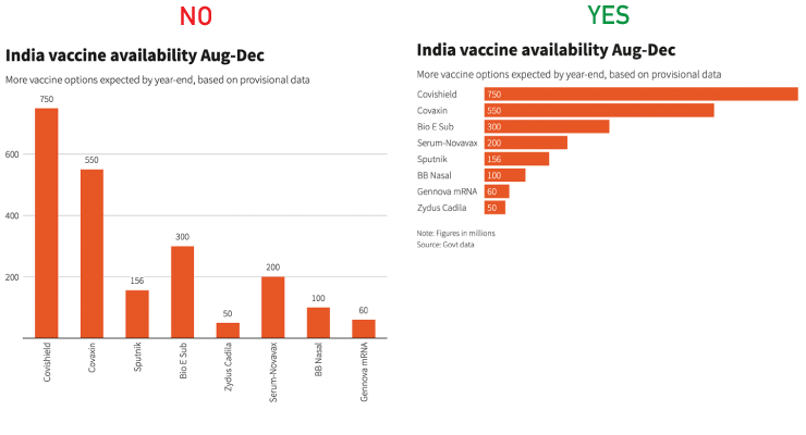
Pies, save ‘em for dessert
✘ DON'T Make pie charts
✓ DO Make bar charts
At Reuters Graphics, we’re not big fans of pie charts. Why? Our brains are bad at comparing the sizes of a pie’s slices to one another. The difference between 30% and 40%, for example, is not very dramatic when represented as a pie chart, but is often a VERY important difference to consider when making comparisons.
Bars, however, are very easy to visually compare, and are almost always a better choice for your data than a pie.
Still not convinced? Well, don’t take ourt word for it:
Text direction
✘ DON'T Rotate text to make room for long labels
✓ DO Use chart types that fit your text
In some cases, Datawrapper may rotate your labels to make room for them on the x axis, for example on the bar chart below. Rotated labels are hard to read. The easy fix is to simply to use horizontal bars.
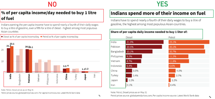
Plain language dataviz
✘ DON'T Use wonky names or abbreviations
✓ DO Rename variables to easier to understand terms where you can
Data terminology is often wonky. Part of our job as journalists is to simplify and explain. To that end, we want to use simple and common language when labeling charts so the reader understands what they’re reading.
Try not to repeat language in labeling. For example:
◼︎ Diesel as % of per capital income/day◼︎ Petrol as % of per capital income/dayCan be more succinctly written as:
Share of daily income needed for 1 litre of: ◼︎ Diesel ◼︎ PetrolDon’t emphasize too many things.
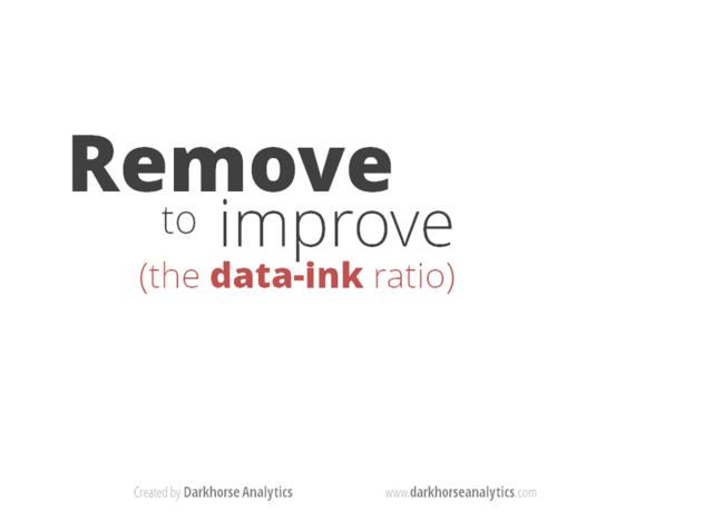
Remove to improve
✓ DO THAT! 👆👆👆
Too many colors, labels, axes labels, etc… can make your chart harder to read. You don’t want to overload the reader. When in doubt, fall back on the axiom, “Remove to Improve.”