Building with components
- What’s a component?
- Parts of a Svelte component
- Props
- Structuring your component’s directory
- Driving components with Google docs
Video walk-through ▶️
Tip: This video is a complete intro to writing Svelte in our new graphics kit from the ground up by writing a simple before & after image slider. It’s a longer video, but if you’re coming in fresh to Svelte and the concept of components, it’s a good spot to start.
💡 You’ll follow along more easily if you’ve checked out the first 3 - 4 sections of the official Svelte tutorial.
What’s a “component”?
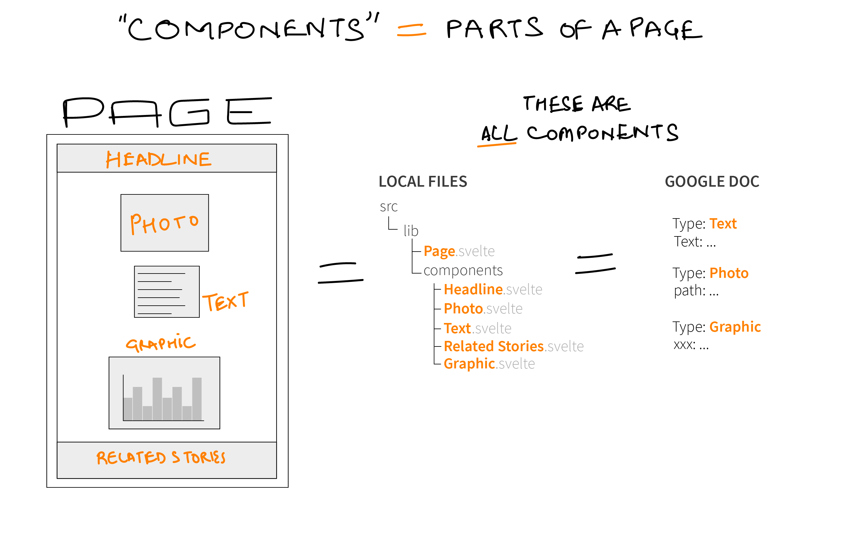
If you’ve gone through any of the Svelte tutorial, you’ll know pages in Svelte (and React, Vue and basically any modern JS framework) are made up of components.
While you could write your page as a single, massive component, when you’re just starting out, it’s useful to think of components as the separable parts of your page.
So, for example, a typical graphics page could be composed of the following components:
- Your headline
- A photo
- Some text
- A graphic
- Some referrals
Some of those components may be used several times on your page (text) while others are a once-off (headline).
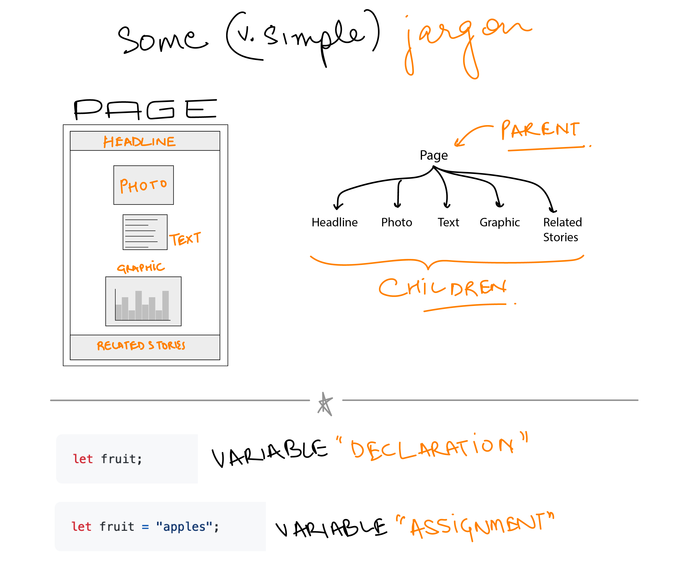
If you think about your page outlined in components, then, your page may look like this:
+ Headline
+ BodyText
+ Photo
+ BodyText
+ Chart
+ BodyText
+ Referrals
Parts of a Svelte component
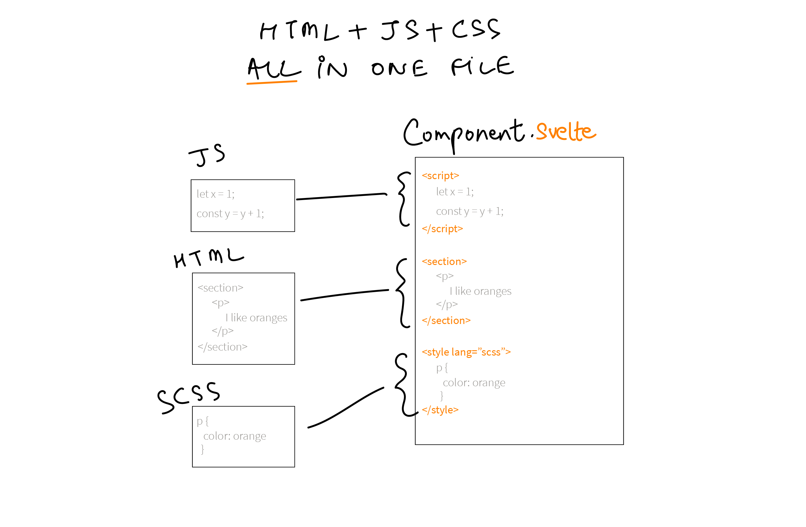
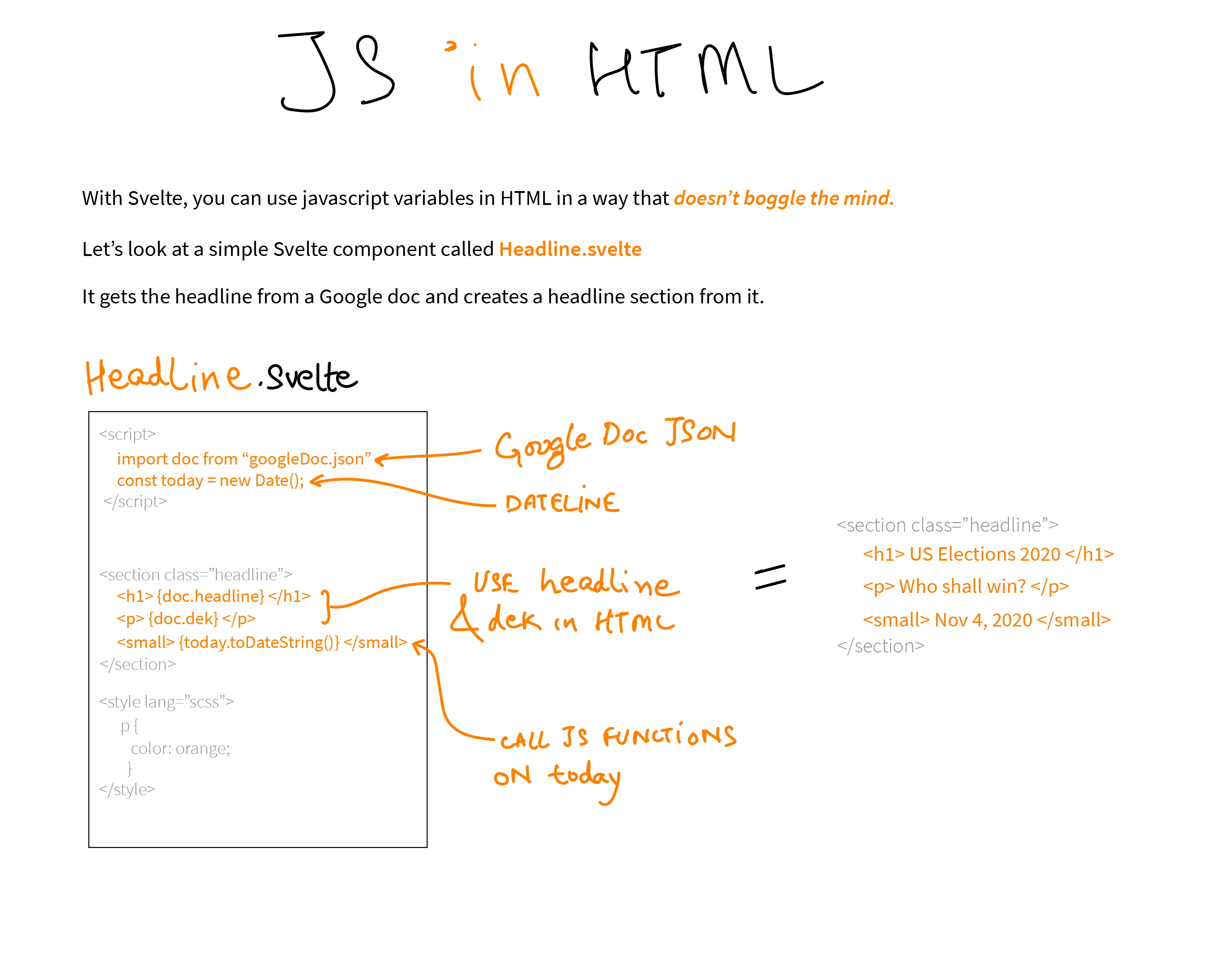
Svelte components include not only have all the component’s html but also any JS and SCSS needed for the component all in a single file. This structure makes it easy to work on parts of your page in isolation and encourage strong organization in your project.
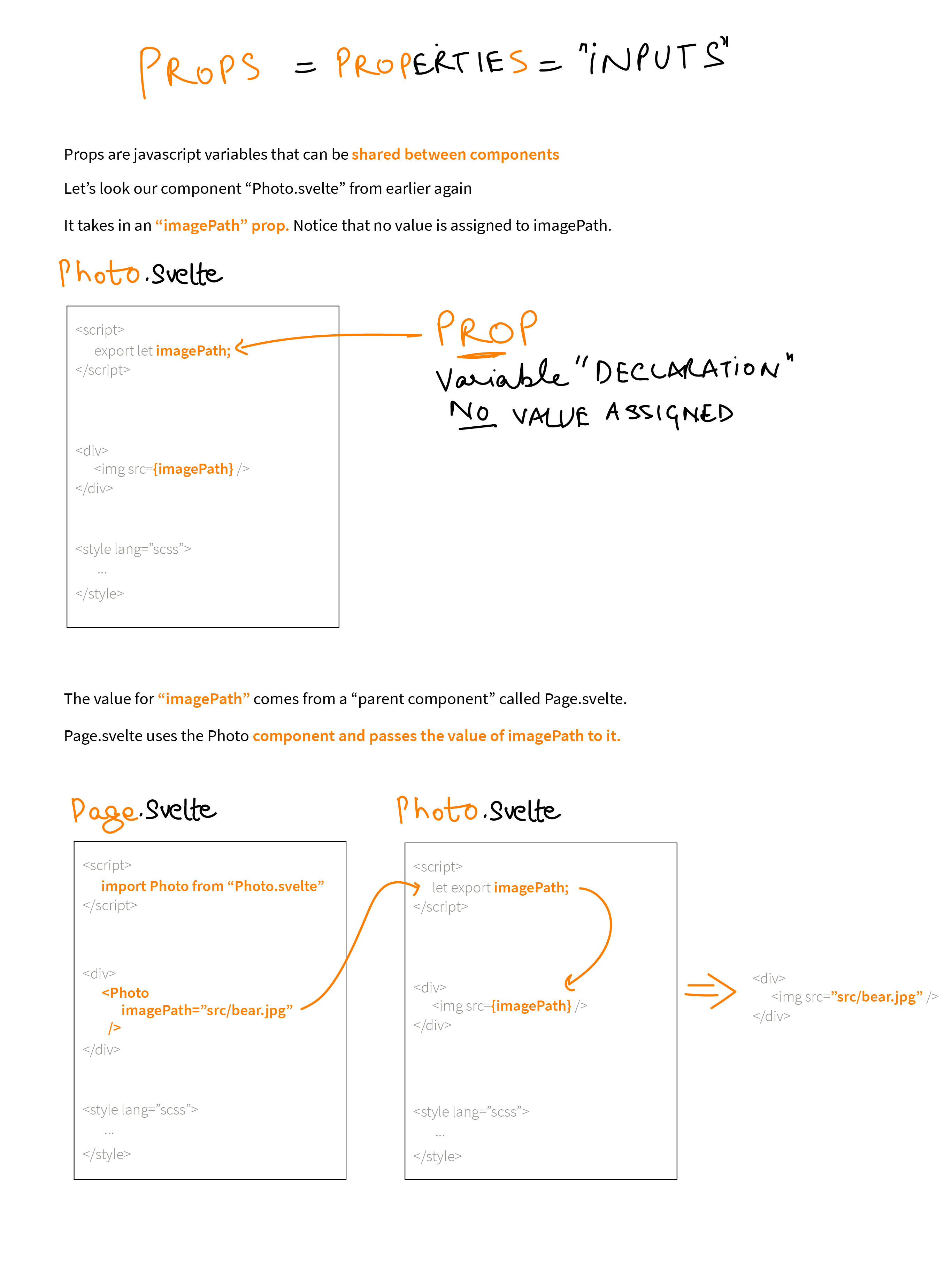
Props
At it’s core, reusability of a component is driven by these things called “props”, which can be really powerful once we learn how to think about them. Let’s dive in.
First, let me start with some jargon.
Now, to explain what props are:
Structuring your component’s directory
Once you know what components your page needs, it’s a good idea to structure each component within the lib/ directory:
src/
  lib/
    components/
      Headline.svelte 👈
      BodyText.svelte 👈
      Chart/
        barchart.js   👈
        index.svelte  👈
      Map.svelte      👈
    App.svelte
Now you can tie your components together in App.svelte to follow your outline:
<script>
  import Headline from './components/Headline.svelte';
  import BodyText from './components/BodyText.svelte';
  import Chart from './components/Chart/index.svelte';
  import Map from './components/Map.svelte';
</script>

<Headline />
<BodyText />
<Map />
<BodyText />
<Chart />
<BodyText />
Driving components with Google docs
In practice, we usually use Google docs to outline and layout our pages and to supply the text to our components. So when tying together your components, you may want to make them part of the block structure pre-written in App.svelte. For example:
<script>
  // Content from your Google doc
  import content from '$locales/en/content.json';

  // Your components
  import Headline from './components/Headline.svelte';
  import BodyText from './components/BodyText.svelte';
  import Chart from './components/Chart/index.svelte';
  import Map from './components/Map.svelte';
</script>

<Headline hed="{content.Hed}" />

{#each content.blocks as block}
  {#if block.Type === 'text'}
    <BodyText text="{block.Text}" />
  {:else if block.Type === 'chart'}
    <Chart title="{block.Title}" note="{block.Note}" />
  {:else if block.Type === 'map'}
    <Map title="{block.Title}" note="{block.Note}" />
  {:else}
    <div></div>
  {/if}
{/each}
This is a simplified example of how you can use components. Read on in these docs for more details on how to build up your graphics page.